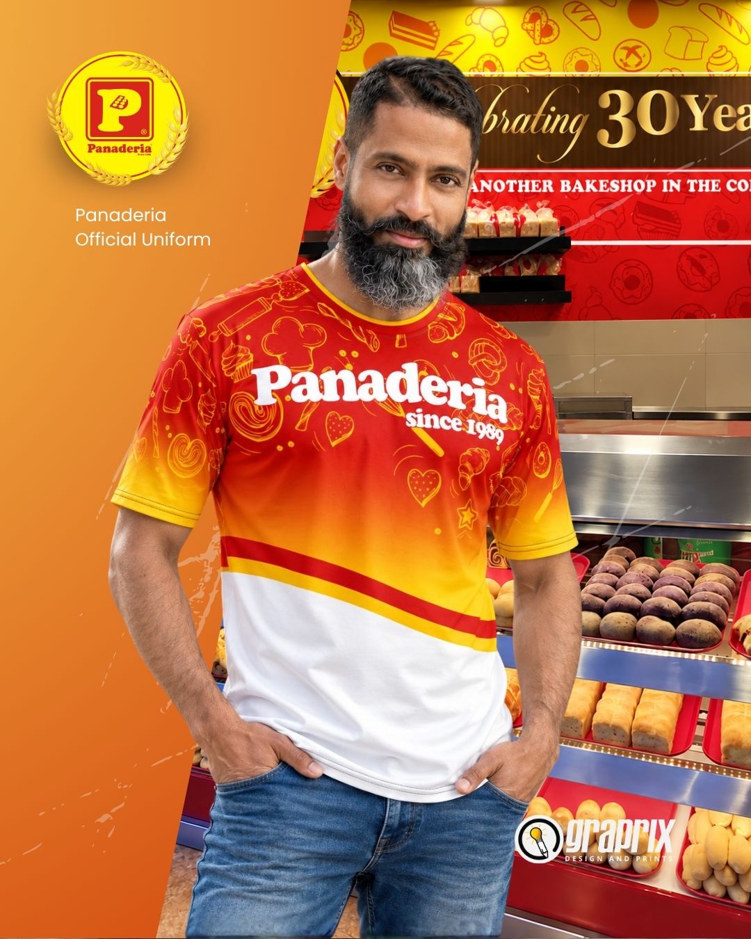
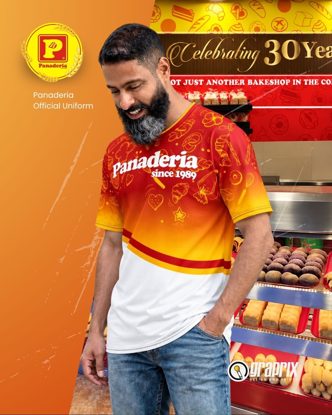
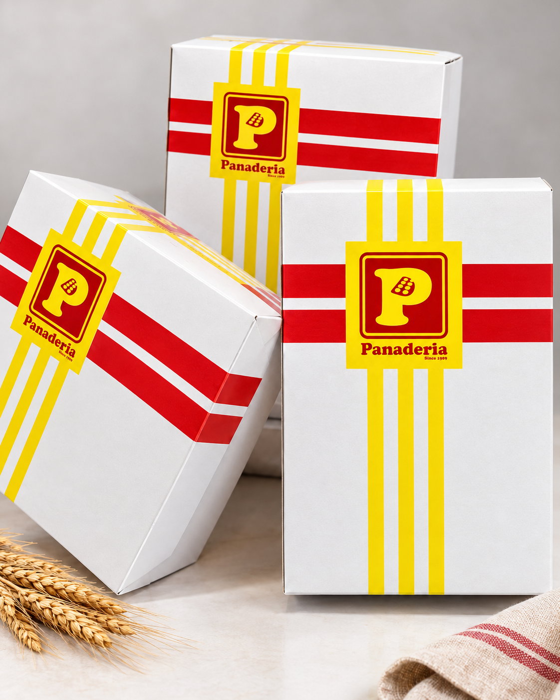
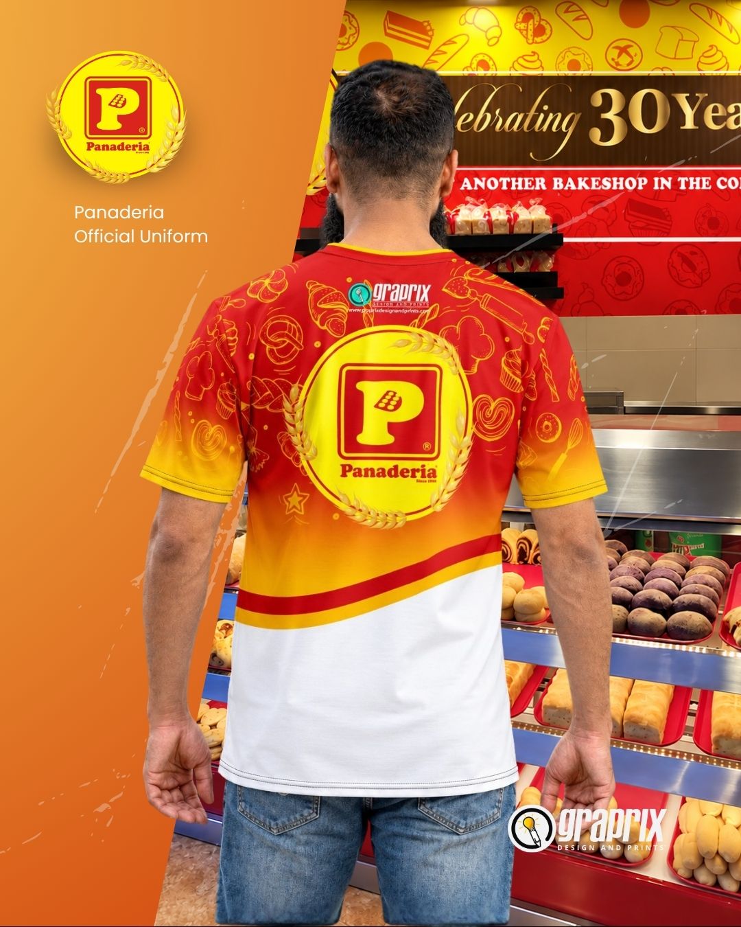
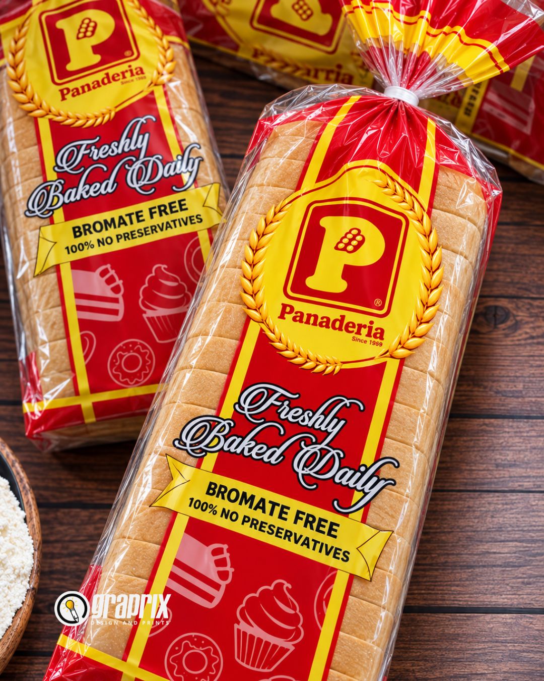
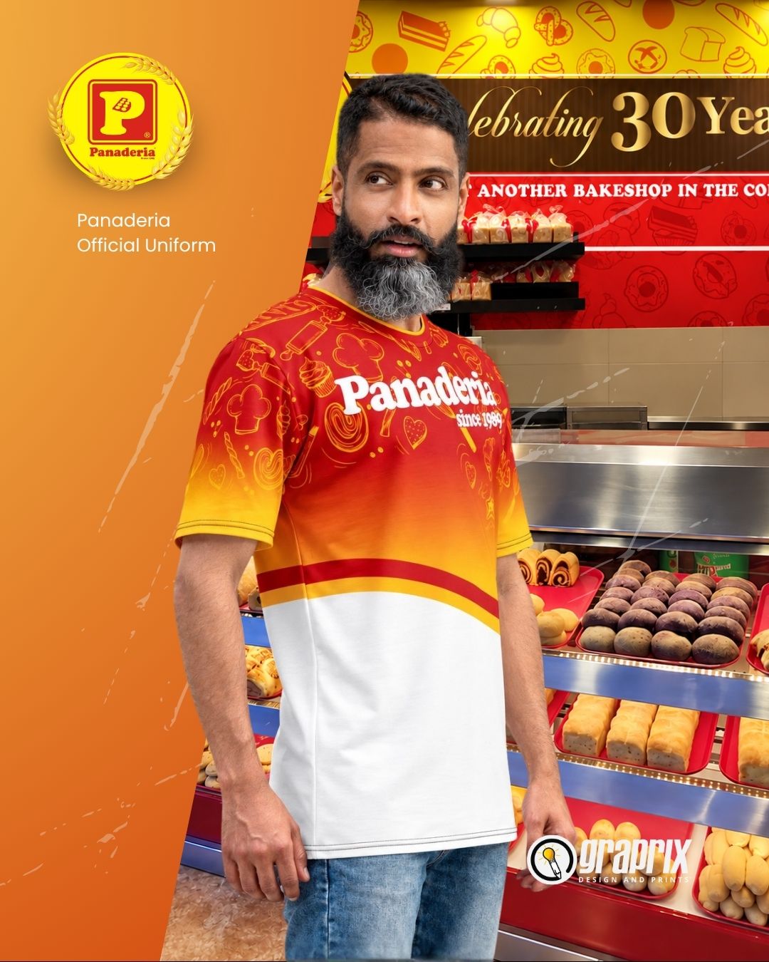
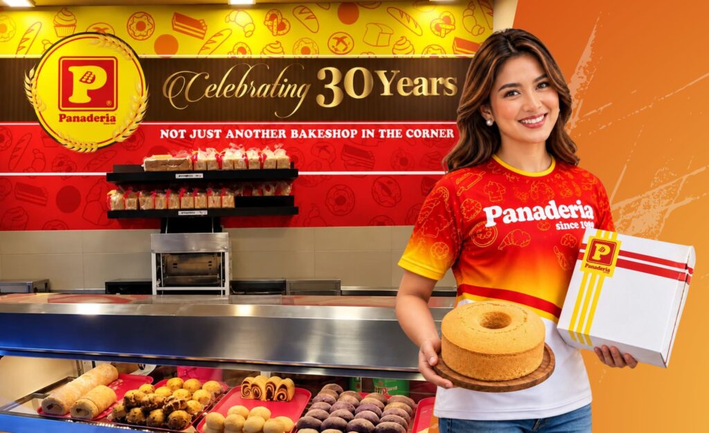
A cohesive brand experience for Panaderia—bringing its familiar red-and-yellow identity across packaging, uniforms, retail displays and anniversary storytelling.
Panaderia’s identity is built around recognizable colors, a memorable emblem and a warm bakery atmosphere. The goal is to carry those familiar cues consistently from the storefront to the product in a customer’s hands.
The Challenge
Connect every customer touchpoint—from anniversary promotions and store graphics to takeaway packaging, bread labels and staff uniforms.
01 / Overview
The Design Approach
Use red and yellow as signature brand assets, balance them with clean white space, and repeat simple stripes and bakery-inspired patterns to create recognition.
One identity. Every touchpoint.
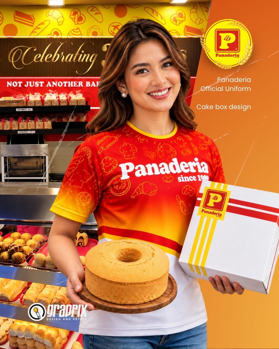
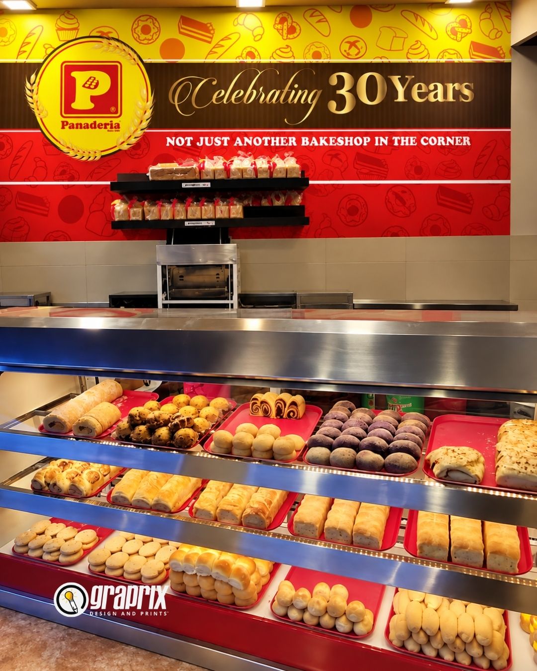
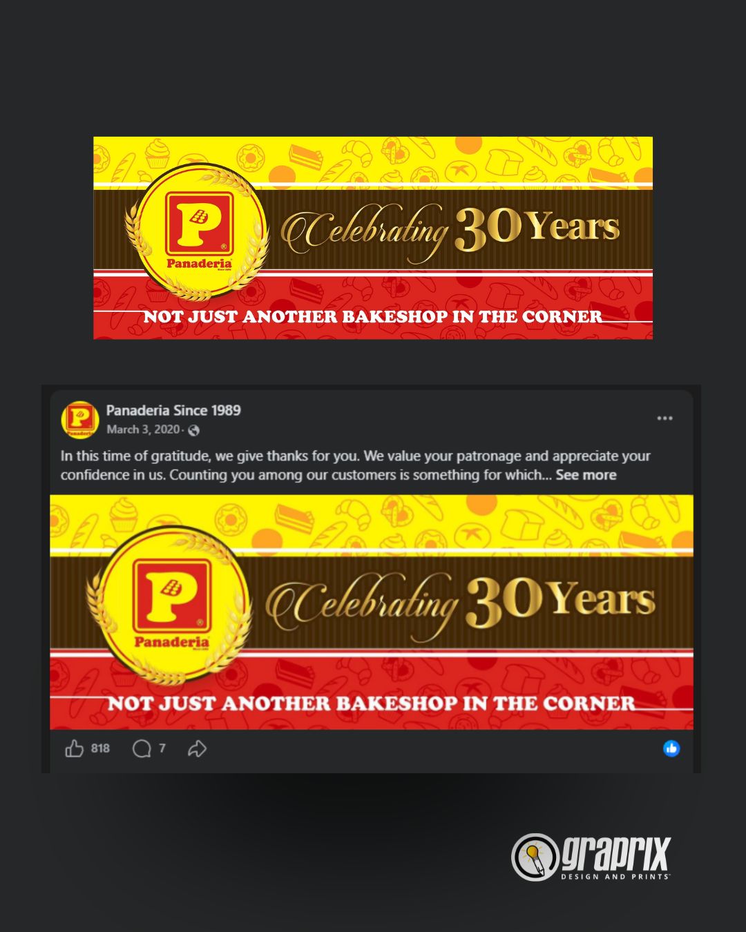
A selection of campaign, packaging, retail and apparel applications showing how the brand can remain recognizable across different formats.
02 / Brand in Use
03 / Visual System
Built around recognition.
Suggested palette and font matches based on the supplied artwork. These are web-use recommendations, not verified original brand specification files.
Playfair Display
Suggested for expressive campaign headlines and anniversary messaging.
Montserrat
Suggested for clear labels, navigation, captions and supporting information.
Panaderia Yellow
#FFED00
Bakery Red
#E51E26
Dark Chocolate
#4A260F
Warm Gold
#D9A52E
Bread Cream
#F5EBDD
04 / Design Principles
Consistency creates trust.
A flexible system lets the brand adapt to different placements without losing its familiar character.
01 / RECOGNIZE
Lead with signature color
Use red and yellow in deliberate blocks to make the brand easy to spot.
02 / REPEAT
Build visual continuity
Carry stripes, emblem placement and bakery motifs across packaging, apparel and displays.
03 / SIMPLIFY
Keep information clear
Give product names and key messages enough contrast and breathing room.
VIEW MORE WORK
Prymal Fitness Branding
average at best
Cuppies Cakies and a Kitchen Baltimore
RM Davaos Best Aquaculture case study
BXFT-Fitness Apparel
Bringmee
Panaderia
The Result
A more connected bakery brand experience.
From campaign graphics to packaging and uniforms, this design direction creates a consistent visual language that helps every customer touchpoint feel like part of the same Panaderia story.
START HERE
Let's Talk About Your Project.
Share what you need. We'll use your project details to understand the right next step.