Graprix Design Library

Brand Identity · Print · Apparel · Merchandise

Bringmee Branding System.

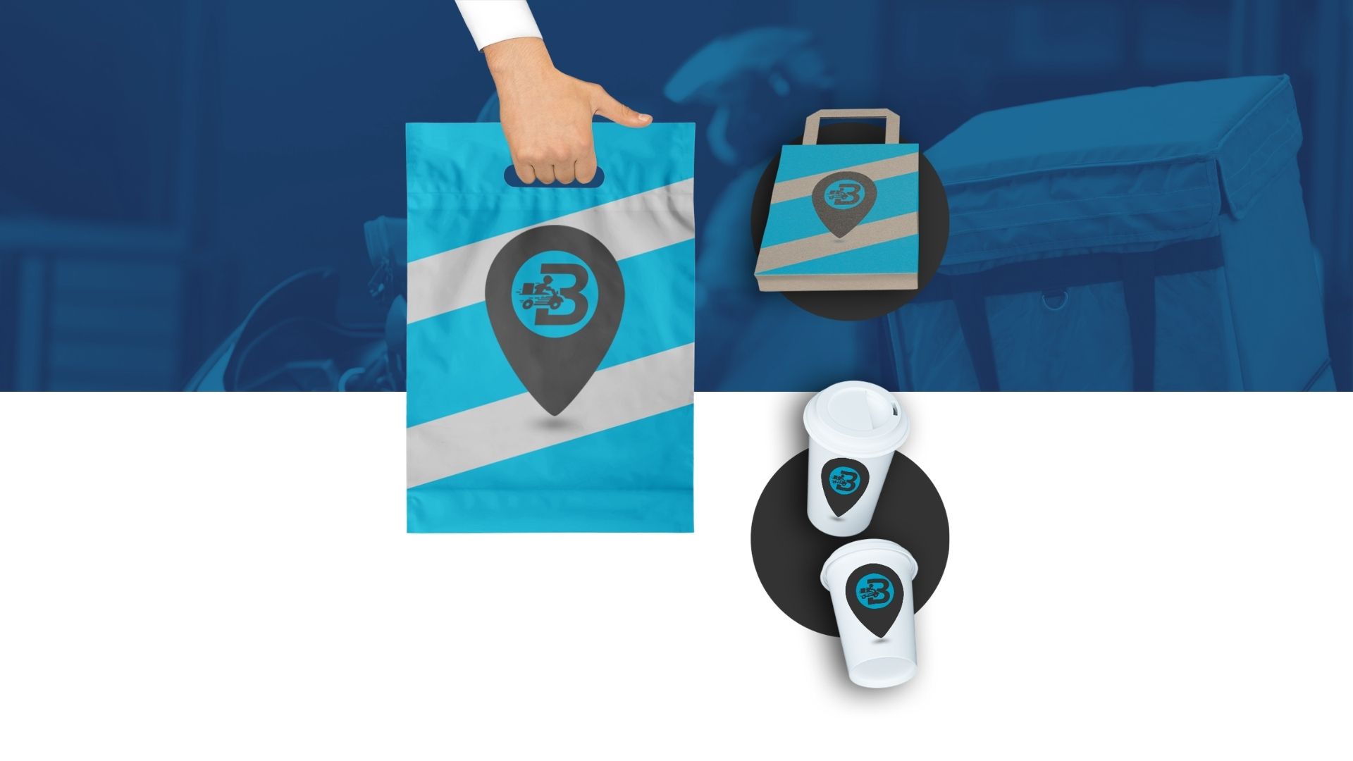
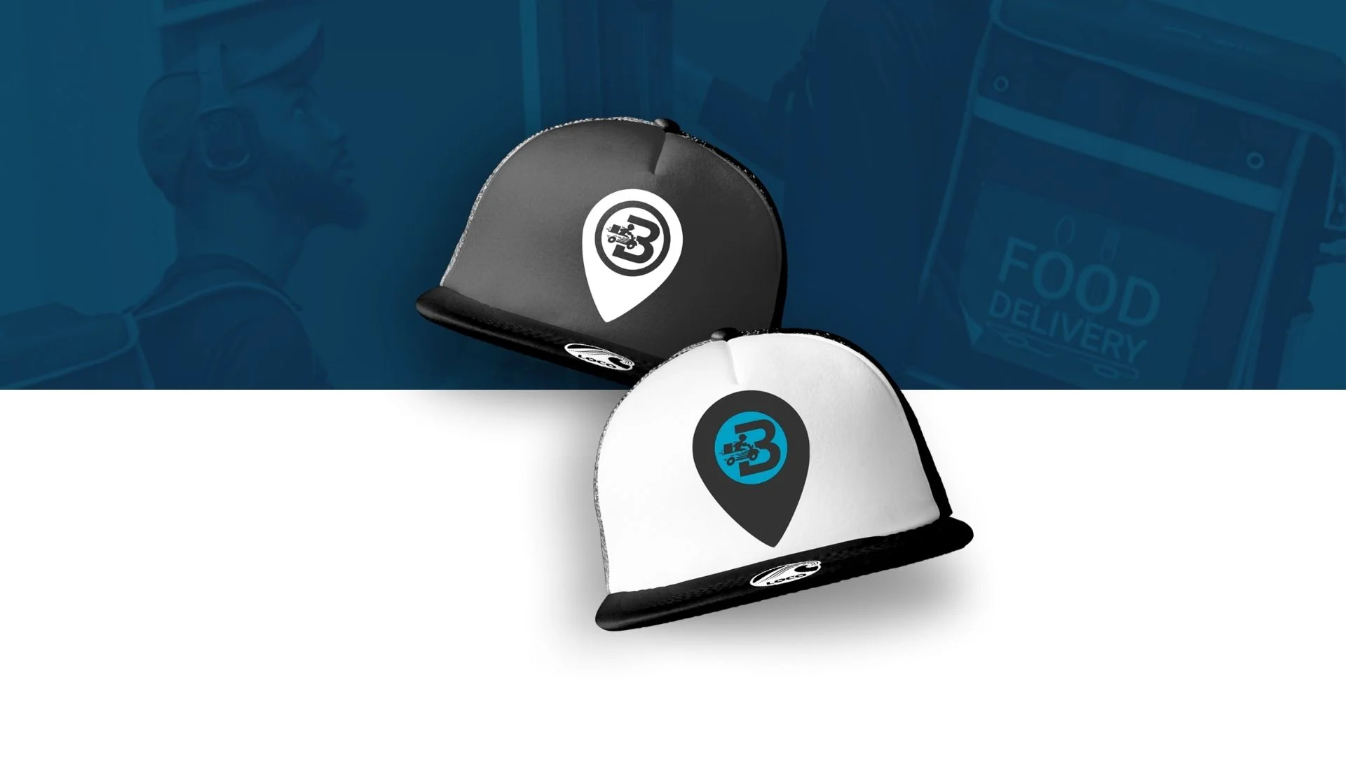
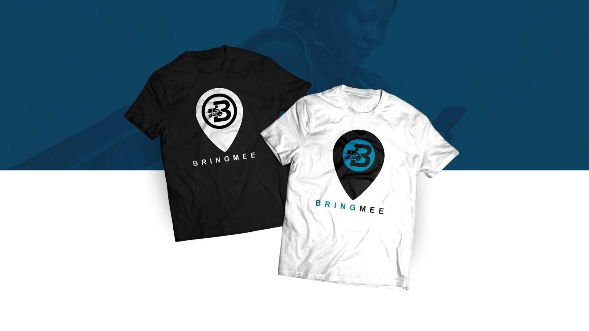
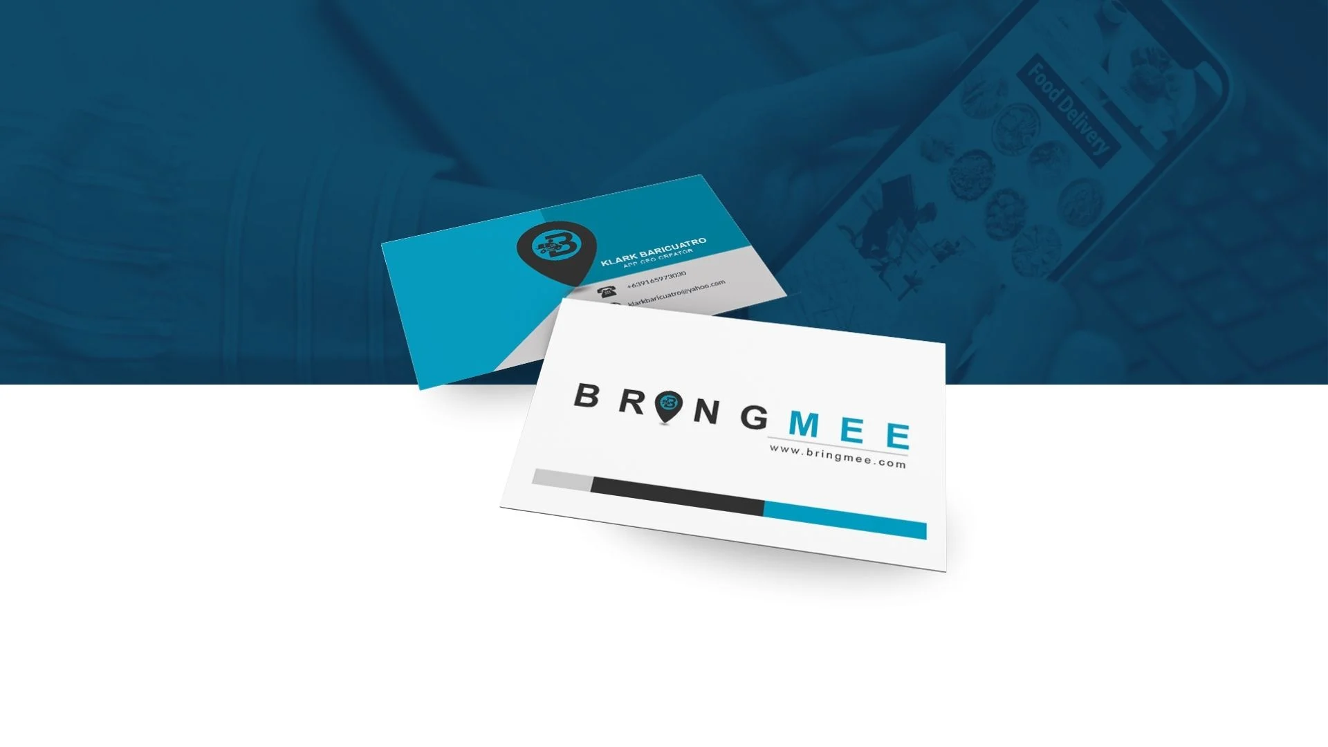
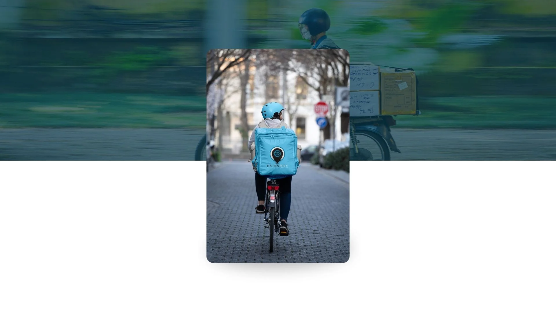
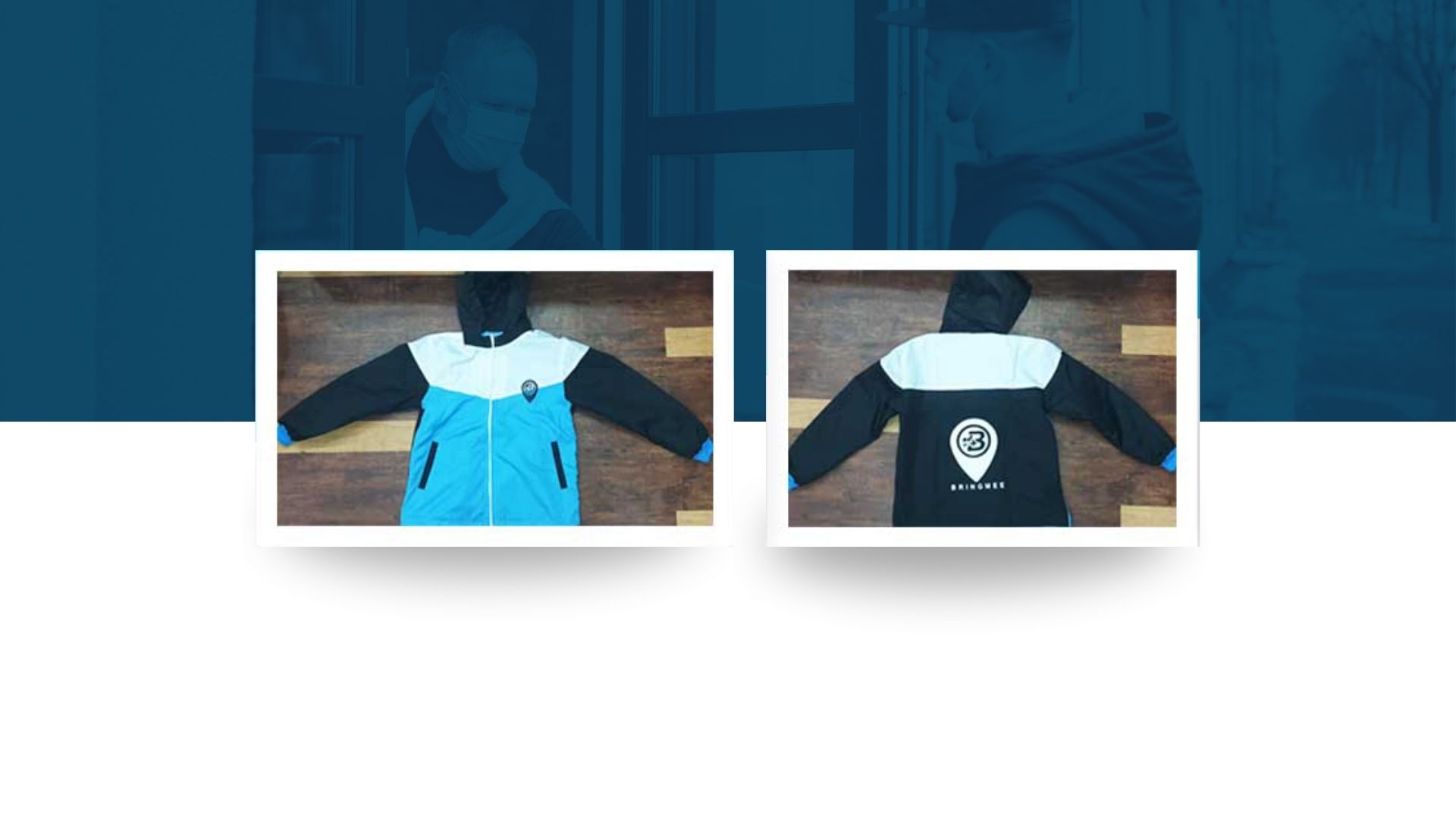
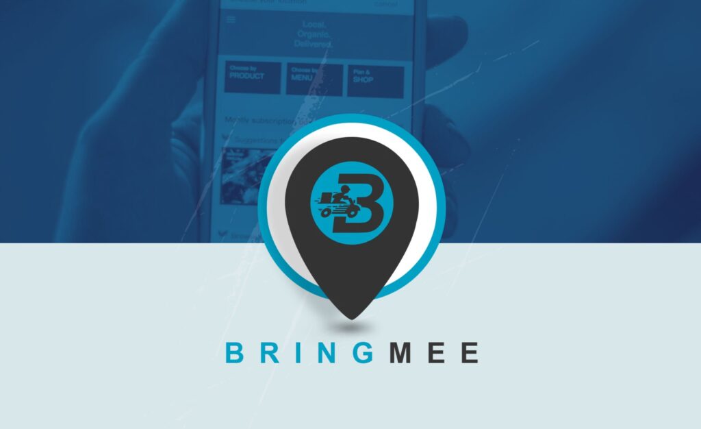
A coordinated visual identity presented across everyday brand touchpoints. The supplied portfolio shows Bringmee’s location-pin-inspired logo, business cards, branded caps and T-shirts, packaging, drinkware, jackets, and a delivery backpack—all connected through a bold turquoise, black, and white palette.


Built for brand consistency.

The portfolio demonstrates how a core mark can be adapted across physical and promotional items while maintaining a recognizable visual language.

Creative approach

Distinctive symbol:

a location-pin shape frames the central monogram.

Consistent palette:

turquoise, black, white, and restrained gray support a clean, contemporary presentation.

Multiple touchpoints:

stationery, apparel, accessories, packaging, and delivery equipment share the same brand cues.

Practical application:

the mark is presented at different sizes and on both light and dark surfaces.

Project details

Brand: Bringmee

Project type:

Visual identity and branded application concepts

Applications shown:

Logo, business cards, caps, T-shirts, shopping bag, cups, jacket, and delivery backpack

Design focus:

Cohesion, legibility, and repeatable brand recognition

The supplied image supports the listed visual applications. Business category, project dates, production details, and measured results were not provided, so this case study does not make claims about them.

Typography recommendations

Font style

The supplied image does not identify the original font files. These are recommended web typography choices, not verified font matches for the logo.

Montserrat / Arial Bold

For headings and brand-forward titles.

Inter / Arial

For body copy, contact information, and readable supporting text.

LETTER-SPACED CAPS

For short labels and brand details, used sparingly.

Visual identity guide

Color palette

Suggested web colors interpreted from the supplied portfolio image. Confirm against the original logo files before treating these as official brand specifications.

Bringmee Teal

#079DB8

Charcoal

#172126

White

#FFFFFF

Mist Gray

#D8E7EA

Case study summary

A consistent brand, carried beyond the logo.

Bringmee’s visual presentation shows how a core identity can extend into stationery, apparel, accessories, packaging, and delivery gear. Graprix can use this case study to demonstrate the value of coordinated design across the customer-facing brand experience.

VIEW MORE WORK

Work with Graprix

Make every brand touchpoint feel connected.

From logo identity and business stationery to apparel and branded merchandise, Graprix Design and Prints helps businesses create a consistent visual presence.

START HERE

Let's Talk About Your Project.

Share what you need. We'll use your project details to understand the right next step.

No commitment required to submit your initial inquiry.